Creating a visually appealing grid layout for your Instagram page can be tedious, but it’s worth it!
Businesses, creators, and influencers use Instagram to sell their brands, and having a well-designed page is a key part of that. If you’re dedicated and willing to do the work, you can create a fantastic grid layout for your page.
In this article, we’ll take you through the steps you need to follow and provide some practical examples to help you along the way.
How Does Instagram Grid Layout Work?
Instagram has come a long way from its early days of monotonous layouts. Users are now trying all sorts of different grid layouts to make their pages stand out. So we’re seeing puzzle-like layouts, checkerboards, cool photo galleries, and other incredible visuals.
You can now do numerous things from the tip of your fingers, including visually changing the shape of your posts and using unique fonts in your caption.
Instagram grid layout is a way of posting multiple pictures or videos in an overall design on your account to improve the visual appearance of your page. You can use different templates to create grid layouts in sequences you find suitable.
Many top Instagram pages use a grid layout that works for them. They work hard to ensure they do not deviate from the established pattern. So, you’ll see many users scheduling their posts to keep these patterns alive and ensure their page remains orderly.
You must make your posts orderly if you want a good Instagram grid layout. This way, when people visit your page, they can quickly grasp where you specialize. This tends to impact whether or not they will engage with your posts and can improve your brand analytics.
How to Design Your Instagram Grid Layout
Now that you have a basic understanding of how Instagram grid layouts work, you should start working on creating your own. Even if you have to start from scratch, it will become easier over time. Here are some things to keep in mind as you get started.

Sketch the Design
The first step is to sketch out the ideal Instagram page you desire. Then, you can use third-party photo editing software to preview your design. Arrange nine posts in the order you wish to upload them and see what they look like on a mock Instagram page. This visual representation will let you know if you need to make some adjustments.
Use Editing Apps to Achieve It
Now is the time to bring the sketch to life. Fortunately, many applications and platforms help people edit photos and videos to make them Instagram-ready. Some of the best Instagram editing apps are free, while others are paid, but the features you get are mostly worth the price. Use one or more of these apps to edit your photos and videos into the template before posting them.
Ensure it Represents Your Brand Well
Another element to note while designing your Instagram grid layout is your brand style. Ensure that everything about the new layout matches your brand and represents it adequately. You can read up on choosing the perfect Instagram color palette that will fit your image. For instance, a rainbow color theme will be unsuitable for a corporate Instagram business page.
Be Consistent With the Design
An unconventional design can ruin the visual experience for viewers. Avoid this by keeping your design consistent with the established template. Learning how to change fonts on Instagram may seem like a lot of hard work, but it’s an effective way to make your page stand out.
Schedule Posts to Keep Up With the Design
Plan and prepare your posts ahead of time. Many brands create a schedule and stick to it to ensure they don’t make any mistakes. This makes scheduling a great choice, as you can create multiple posts at once and set different dates for them to be posted.
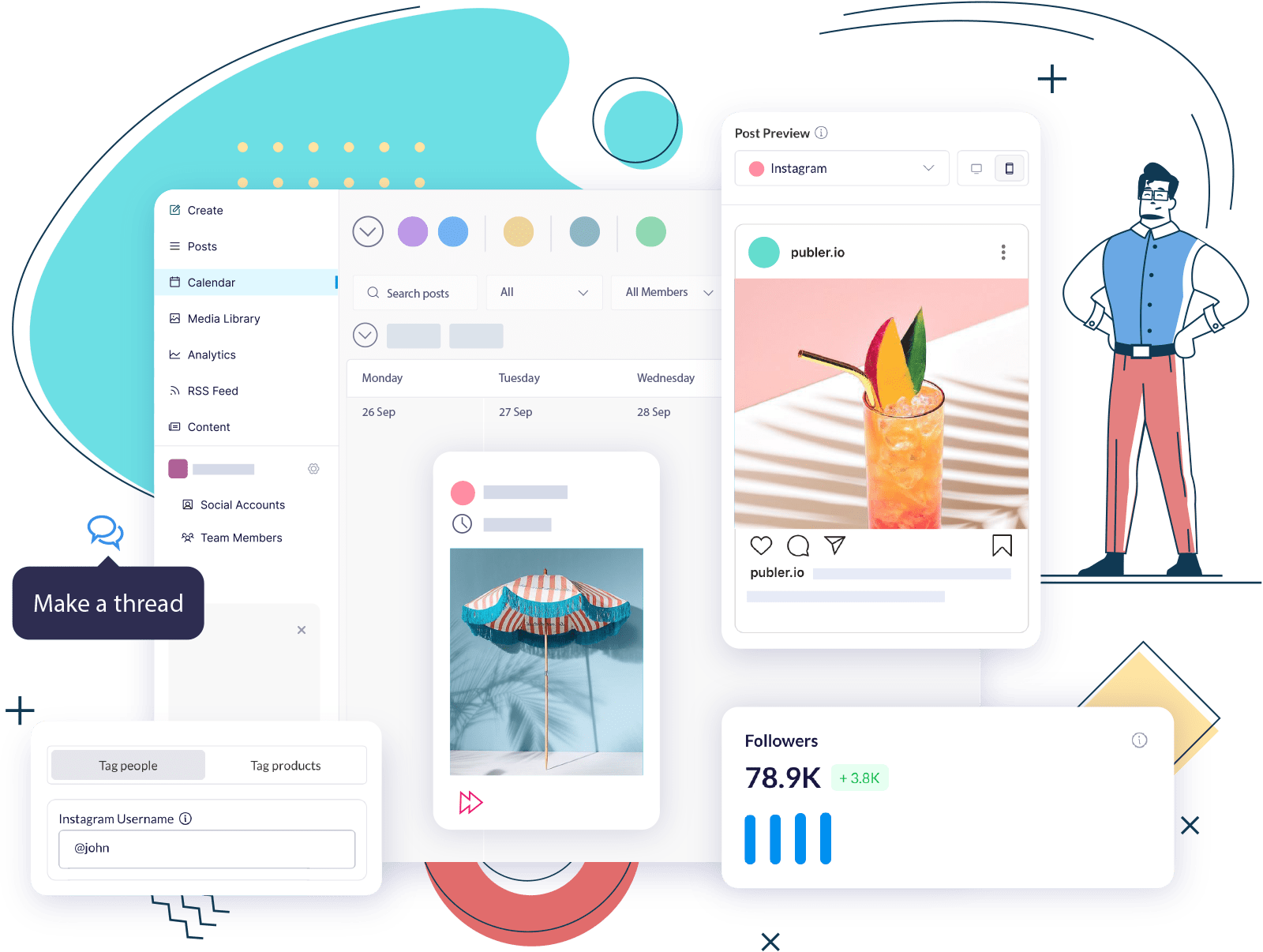
Social media tools like Publer allow you to schedule your posts in advance and it’s a great way to keep your posts organized and make it easier to keep up with the design.
5 Awesome Instagram Grid Layouts
We’ve curated 5 awesome Instagram grid layouts that will look good on your page. Note that the layout you choose should reflect your brand image. Your Instagram post idea can influence your grid layout or vice versa.
Check out some top examples here:
Uniform Color Scheme
A terrific way to make your Instagram page appealing is to use a uniform color scheme. The color you choose should not become unappealing once it takes over the entire page. It should show what your page is about and connect to your niche. If you use filters, ensure it is also uniform to maintain the vibe.
Alternating Color Scheme
Another option is to alternate the color scheme. With this design, you can use a neutral color with a bold color. Many people appreciate this variety, and it may be suitable if your brand has two contrasting sides. Here, @korean_hangeulu alternates colors between rows.

White Borders
White borders are best if you want a simple design to unify your posts regardless of the content. This design is a classic for minimalists and perfectionists. It gives your posts an aura of elegance and vintage sophistication, as you would find on @georgiegibbers posts.

Checkerboard
One of the most interesting Instagram grid layouts is the checkerboard style. This design looks like floor tiles in homes, as the posts alternate between two designs. The most popular style is a quote/text after a picture, followed by another picture. Here is an example from @amarihaircare.

Puzzle
The final design we will cover is undoubtedly one of the most creative but challenging. It is the puzzle design. The puzzle design involves splitting a single picture into 9 or 12 bits. This style may be too cumbersome for regular posts, so perhaps you can reserve it for special occasions.
Try Publer’s Instagram Grid Layout Maker for Free
Publer offers a comprehensive solution where you can seamlessly upload your files, add captivating copy, and include suggested hashtags, all while collaborating with your team for valuable feedback within the same tool.
Unlock a seamless Instagram feed experience with Publer, enabling you to effortlessly drag, drop, rearrange, schedule, and publish your posts. Say goodbye to confusion, publishing errors, and time wasted on manual posting.
By signing in to Publer, you’ll gain access to a visually pleasing representation of your Instagram grid, displayed below for your convenience.

Our tool also features an icon that provides instant clarity on whether a post has already been published or scheduled for a specific time.

Finally, a good Instagram grid layout will give you a lot of benefits, including increasing your engagement. All you have to do is think of the most suitable design for your brand. Creating your dream design may seem tedious, but it becomes easy once you have a template.
For a perfect Instagram grid layout, we suggest you these tips below.
- Plan your grid layout design and remain consistent with it.
- Ensure the layout you choose matches your brand image well.
- Check out some awesome Instagram grid layouts to see which suits your brand.
Try Publer for free today and start creating your grid layout with our app integration (Canva) for the best and most aesthetically pleasing templates.

Denisa Lamaj